Making over the Kia Owner’s site
Kia USA
•
2024
web design
wireframing
prototyping
site audit
competitive audit
navigation
Team
Experience Strategy/UX: Kenzie Green
UI: Morgan Bennett, Brian Song
Copy: Coral Robertson
Account: Hayley Funk, Kelli Owens, Caleb Barbara Hudson
PM: Rob Ferrante
Abstract
Kia.com received a full makeover with continued love and care over a few years thanks to our dedicated Kia team, but this left the Kia Owners’ section of the site feeling disconnected, outdated, and in need of a little TLC. This project allowed us to take a giant step forward in modernizing and creating a connected and easier-to-use experience - one that owners of Kia vehicles deserve, and one that allows Kia to continue to provide value to customers after a major vehicle purchase.
The Ask
Redesign the Kia Owner’s Website to be consistent with kia.com.
Problems to Solve
Creating Consistency out of Disconnected Experiences
There were four digital experiences with disconnected designs: kia.com, kia.com/owners, the Kia Owners app, and the infotainment dashboard in-vehicle. We needed to match the kia.com designs as much as possible, while considering the established designs and patterns of the app and infotainment center that owners frequently engage with.
Limited Development Capabilities
Due to time, budget, and resourcing, we were limited to reusing existing components as much as possible. We were working with a development team that sometimes struggled with new interactions and complex designs, so we had to work very closely with the team to stay within their capabilities while continuing to push the design and experience to be as good as it could be.
The Work
Site Audit
To set up the redesign for success, we first evaluated all in-scope pages (and definitely inspected out-of-scope pages to get the full picture) to:
- Identify key themes to address
- Match existing components from kia.com to sections of the Owner’s site
- Bring awareness to major usability and accessibility issues, using it as an opportunity to educate the client on why they’re important and how to avoid these issues moving forward
We used this work to lead a discussion with our clients to collect their feedback on their current site experience. We wanted to collect as much information as possible - what is working? What isn’t working? What do you hear from the call center? What information do you have from feedback or research?
Making the sausage in FigJam: identifying content goals, noting opportunities for improvement, and brainstorming how we can use existing components.
Examples of what we shared: key findings for UX education and consideration for ongoing experience improvements. In-depth examples were shared in the appendix to reference.
Competitive Audit
As part of our initial strategy and redesign preparation we evaluated the owners’ web experiences of competitor OEMs to identify trends, potential owner expectations, and standards, with a focus on navigation, IA, and entry points to owner-specific content.
We looked at tech-forward OEMs, Tesla and Rivian, to explore what users refer to as “best in class” and find inspiration to continue to establish Kia as a tech-forward and more luxurious brand.
Redesign
The redesign may have been limited in scope and capabilities, but we were determined to make dramatic improvements. We were intentional to educate the clients along the way, explaining rationale and sharing UX education, empowering them to continue advocating for a better experience.
Navigation
We had pitched an updated navigation to this team a few times, so we took this opportunity to give it some much needed updates!
Using our past work trying to pitch navigation improvements, the findings of the competitive analysis, data on the most visited pages on the site, the knowledge of the existing kia.com navigation, and an exercise of breaking down the current site map and putting it back together, I proposed some navigation improvements.
Before: Navigation had become a dumping ground for links, broken, and was difficult to move between the authenticated portal and other resources on the site.
Before: Primary navigation for the website.
Before: Navigation for the authenticated portal. A completely different navigation strategy, adding a side bar and removing the main nav. This worked in the dashboard, but made it difficult to to access the valuable unauthenticated content once a user logs in.
After: We wanted to create an in-dashboard navigation solution that worked throughout the rest of the site: maintaining easy access to non-dashboard content, allowing clear paths back to other pages, while bringing forward the in-dashboard navigation paths.
We proposed a solution that matched the kia.com L2 navigation design. Kia.com uses an L2 navigation on vehicle model pages. This design worked as a quick solution, allowing us to reuse designs from kia.com (one of the key asks of the project), and making an improvement to the usability and IA of the owner’s site.
After: Primary navigation for the website.
After: Portal navigation, seamlessly connected to the primary navigation and matching interactions that have been established on kia.com.
Pre-Login Experience
There were six key screens in-scope for the pre-login/unauthenticated section of the site. This work was relatively straightforward and focused on reskinning the designs to match kia.com, with some strategic content improvements on pages that warranted it.
(Some of the) Strategic Improvements:
- Prioritizing valuable and frequently visited content through additions like quick links below the hero on the homepage
- Improved “Check Availability” experience, focusing on clearly defining what is or isn’t available on a specific vehicle
- Introduced a component for feature-specific pages that updates within the page, allowing quick availability checks without being sent to a new page
- Removing all broken links and dead ends. Replaced with content focused on helping owners find the resources they need for their vehicle, such as scheduling maintenance.
- Clear value propositions and feature communications so users can easily understand what benefits are available for Kia owners
- Extra emphasis on business priorities that offer value for owners:
- The Kia Access App, offering access to even more benefits on the go
- Kia Connect, a monthly subscription that contains the bulk of exclusive features for owners
- The Kia Connect Store, a new business venture that offers even more features
- Direct “How to Activate/Set Up” steps for features, especially Kia Connect, which is the primary source of owner benefits and offers a free trial
Wireframe examples for the homepage and the “Check Kia Connect Availability” screens.
Creative collaboration is a critical step of any project. The magic happens when different perspectives and ideas come together, push each other, and meld into one. Morgan Bennet, my UI counterpart, and I had a well-established working relationship at this point. Although this project was focused on reusing existing components wherever possible, there are always opportunities to push and build on each other’s work. She had great ideas on how to combine the “Check Availability” screens and we were able to elegantly consolidate this flow to keep the “Kia Connect Not Available” messaging on the “select your vehicle” screen.
Landing page for “Check Kia Connect Availability”
Panel shows the entered vehicle
Messaging updates if Kia Connect is not available
Form stays visible to easily check a different vehicle


Final Prototype: Pre-Login
Post-Login Experience
The post-login experience was more dashboard-focused, requiring us to deviate from the “reuse established kia.com components” approach and propose new concepts, looking to highly regarded tech-froward OEMs like Tesla and Rivian for inspiration. There were a lot of small experience and logic improvements that needed to be made which we addressed while breaking down, pulling apart, and putting back together the features of the experience.
(Some of the) Strategic Improvements:
- Modular dashboard approach allowing for scalability, easily responsive between screen sizes, quick scanning for users, and establishing a modern design look and feel
- Brought remote commands directly into the dashboard instead of a separate section, removing clicks to access and highlighting easy use and state visibility of each remote command
- Grouping content and actions by category to help Kia Owners find what they need when they need it: controls, maintenance, emergency, and general owner resources
- Improved “Schedule Service” flow to remember contextual information, making scheduling a service quicker and easier without asking for redundant information every time
- Replaced unclear language with layman’s terms for error flows (ex: “Account Reprovisioned” became “Activate Kia Connect” with clear pathways to proceed on web or in the app)
- Add contextual definitions in layman’s terms to make alerts and schedules more clear, with less questions about “what is this, what does this mean, what am I actually doing”
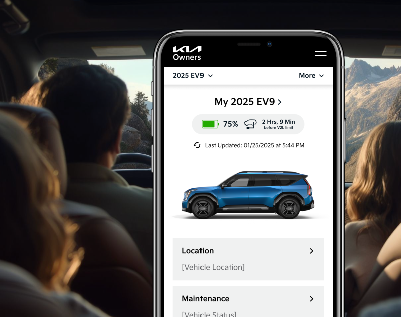
After: Prioritized mobile design, matched and improved interactions established in the Owner’s app, modern design with Kia’s updated branding, and modular blocks to smoothly adapt as Kia Connect capabilities grow and change.


Final Prototype: Post-Login
Final Prototype: Create Account Flow
Kia Connect Store
The Store was a unique problem to solve. Originally there were two completely separate stores: one unauthenticated experience linked from the main navigation, and one authenticated experience linked from the dashboard side navigation. When authenticated it was difficult to find your way back to the unauthenticated store, but each store had different offerings and a very different look and feel.
The Kia Connect Store was a relatively new addition and a high priority for the business. We wanted to make sure this experience worked - for the business as a revenue stream, and as an educational and easy to use experience for users. The store should be an area of exposure of additional features that could benefit or improve the experience of Kia Owners. So let’s make it feel familiar to established ecommerce practices, match their mental expectations, and work across all authentication states!
(Some of the) Strategic Improvements:
- Combined into one unified and consistent store experience for both pre- and post-authentication
- This meant one “Store” link in the navigation!
- Removed the product dropdown list from the navigation, focusing on improving the store landing page for ecommerce scaling as new products are added
- Required product detail pages for all products. Previously, the post-login store did not have PDPs, but the pre-login store did
- Small PDP updates to make them work post-login without a heavy lift: maintain a purchase button pre-login (call to action to log in to purchase), and show price when authenticated
- Subtle but crucial differences between pre- and post-login states: purchase button language, cart visibility
- Purchase button logic reflected the login state: either log in to purchase, or purchase now
- Made recommendations to add filters and categories in the future as more products, something that was not feasible at this point but was strongly recommended for a happy and smooth experience
Before: Inconsistent store screens that were difficult to take action to complete a purchase.
Before: Unauthenticated store landing.
Before: Authenticated store landing.
After: Consistent store experiences that can be accessed through the same interaction, pre- and post-authentication. Unauthenticated users are prompted to log in to purchase an item, while authenticated users are able to view the price and initiate a purchase from this page.

Final Prototype: Kia Connect Store
Results page for vehicles with Kia Connect showcases all the available features with paths to start a free trial.
Results
The Kia Owners’ team used their own development team for this project, and as of December 2025 this work (very sadly) still is not live.
- The Kia Connect Availability experience IS live and we’ve received great feedback from the call center team, sharing that the new experience is easier to use and understand!
- The client loved working with us so much that they were pursuing additional scopes with us before this project had officially wrapped! The work we delivered made them eager to see the full site redesigned.
Testimonials
The new ‘Kia Connect Availability’ page is perfect and [CourtAvenue] is a delight to work with. Great work! I appreciate everyone’s support, from research, design, developing, managing, and testing...your hard work and dedication doesn’t go unnoticed.”
- Nadia Haggie, Kia Owners
Kenzie, I had the chance to go through Owners and a bunch of other Kia work yesterday with the team. Just wanna thank you for all of your brilliant work and collaboration! The team really respects your priority to organize, prioritize, and structure communications. Thank you for all of your contributions. You’re awesome!”
- Michael Stich, CourtAvenue Partner
Landing page for “Check Kia Connect Availability”
Messaging updates if Kia Connect is not available
Form stays visible to easily check a different vehicle
Results page for vehicles with Kia Connect showcases all the available features with paths to start a free trial.
Left panel shows the entered vehicle

Making over the Kia Owner’s site
Kia USA
•
2024
web design
wireframing
prototyping
site audit
competitive audit
navigation
Team
Experience Strategy/UX: Kenzie Green
UI: Morgan Bennett, Brian Song
Copy: Coral Robertson
Account: Hayley Funk, Kelli Owens, Caleb Barbara Hudson
PM: Rob Ferrante
Abstract
Kia.com received a full makeover with continued love and care over a few years thanks to our dedicated Kia team, but this left the Kia Owners’ section of the site feeling disconnected, outdated, and in need of a little TLC. This project allowed us to take a giant step forward in modernizing and creating a connected and easier-to-use experience - one that owners of Kia vehicles deserve, and one that allows Kia to continue to provide value to customers after a major vehicle purchase.
The Ask
Redesign the Kia Owner’s Website to be consistent with kia.com.
Problems to Solve
Creating Consistency out of Disconnected Experiences
There were four digital experiences with disconnected designs: kia.com, kia.com/owners, the Kia Owners app, and the infotainment dashboard in-vehicle. We needed to match the kia.com designs as much as possible, while considering the established designs and patterns of the app and infotainment center that owners frequently engage with.
Limited Development Capabilities
Due to time, budget, and resourcing, we were limited to reusing existing components as much as possible. We were working with a development team that sometimes struggled with new interactions and complex designs, so we had to work very closely with the team to stay within their capabilities while continuing to push the design and experience to be as good as it could be.
The Work
Site Audit
To set up the redesign for success, we first evaluated all in-scope pages (and definitely inspected out-of-scope pages to get the full picture) to:
- Identify key themes to address
- Match existing components from kia.com to sections of the Owner’s site
- Bring awareness to major usability and accessibility issues, using it as an opportunity to educate the client on why they’re important and how to avoid these issues moving forward
We used this work to lead a discussion with our clients to collect their feedback on their current site experience. We wanted to collect as much information as possible - what is working? What isn’t working? What do you hear from the call center? What information do you have from feedback or research?
Making the sausage in FigJam: identifying content goals, noting opportunities for improvement, and brainstorming how we can use existing components.
Examples of what we shared: key findings for UX education and consideration for ongoing experience improvements. In-depth examples were shared in the appendix to reference.
Competitive Audit
As part of our initial strategy and redesign preparation we evaluated the owners’ web experiences of competitor OEMs to identify trends, potential owner expectations, and standards, with a focus on navigation, IA, and entry points to owner-specific content.
We looked at tech-forward OEMs, Tesla and Rivian, to explore what users refer to as “best in class” and find inspiration to continue to establish Kia as a tech-forward and more luxurious brand.

Redesign
The redesign may have been limited in scope and capabilities, but we were determined to make dramatic improvements. We were intentional to educate the clients along the way, explaining rationale and sharing UX education, empowering them to continue advocating for a better experience.
Navigation
We had pitched an updated navigation to this team a few times, so we took this opportunity to give it some much needed updates!
Using our past work trying to pitch navigation improvements, the findings of the competitive analysis, data on the most visited pages on the site, the knowledge of the existing kia.com navigation, and an exercise of breaking down the current site map and putting it back together, I proposed some navigation improvements.
Before: Navigation had become a dumping ground for links, broken, and was difficult to move between the authenticated portal and other resources on the site.
Before: Primary navigation for the website.
Before: Navigation for the authenticated portal. A completely different navigation strategy, adding a side bar and removing the main nav. This worked in the dashboard, but made it difficult to to access the valuable unauthenticated content once a user logs in.
After: We wanted to create an in-dashboard navigation solution that worked throughout the rest of the site: maintaining easy access to non-dashboard content, allowing clear paths back to other pages, while bringing forward the in-dashboard navigation paths.
We proposed a solution that matched the kia.com L2 navigation design. Kia.com uses an L2 navigation on vehicle model pages. This design worked as a quick solution, allowing us to reuse designs from kia.com (one of the key asks of the project), and making an improvement to the usability and IA of the owner’s site.
After: Primary navigation for the website.
After: Portal navigation, seamlessly connected to the primary navigation and matching interactions that have been established on kia.com.
Pre-Login Experience
There were six key screens in-scope for the pre-login/unauthenticated section of the site. This work was relatively straightforward and focused on reskinning the designs to match kia.com, with some strategic content improvements on pages that warranted it.
(Some of the) Strategic Improvements:
- Prioritizing valuable and frequently visited content through additions like quick links below the hero on the homepage
- Improved “Check Availability” experience, focusing on clearly defining what is or isn’t available on a specific vehicle
- Introduced a component for feature-specific pages that updates within the page, allowing quick availability checks without being sent to a new page
- Removing all broken links and dead ends. Replaced with content focused on helping owners find the resources they need for their vehicle, such as scheduling maintenance.
- Clear value propositions and feature communications so users can easily understand what benefits are available for Kia owners
- Extra emphasis on business priorities that offer value for owners:
- The Kia Access App, offering access to even more benefits on the go
- Kia Connect, a monthly subscription that contains the bulk of exclusive features for owners
- The Kia Connect Store, a new business venture that offers even more features
- Direct “How to Activate/Set Up” steps for features, especially Kia Connect, which is the primary source of owner benefits and offers a free trial
Wireframe examples for the homepage and the “Check Kia Connect Availability” screens.
Creative collaboration is a critical step of any project. The magic happens when different perspectives and ideas come together, push each other, and meld into one. Morgan Bennet, my UI counterpart, and I had a well-established working relationship at this point. Although this project was focused on reusing existing components wherever possible, there are always opportunities to push and build on each other’s work. She had great ideas on how to combine the “Check Availability” screens and we were able to elegantly consolidate this flow to keep the “Kia Connect Not Available” messaging on the “select your vehicle” screen.

Final Prototype: Pre-Login
Post-Login Experience
The post-login experience was more dashboard-focused, requiring us to deviate from the “reuse established kia.com components” approach and propose new concepts, looking to highly regarded tech-froward OEMs like Tesla and Rivian for inspiration. There were a lot of small experience and logic improvements that needed to be made which we addressed while breaking down, pulling apart, and putting back together the features of the experience.
(Some of the) Strategic Improvements:
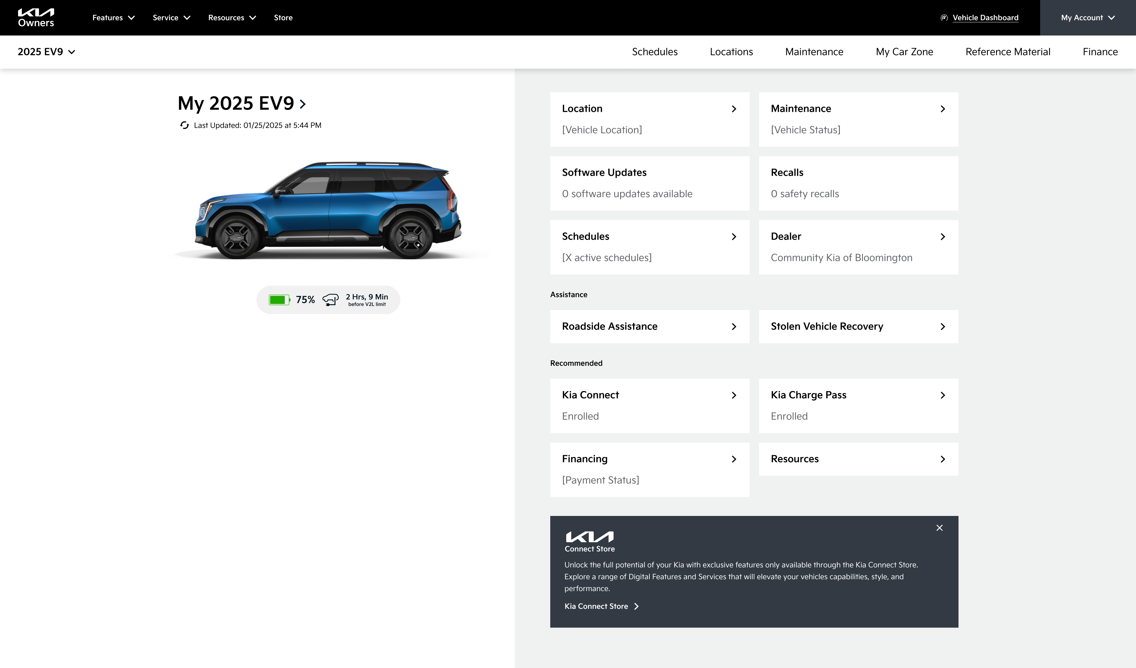
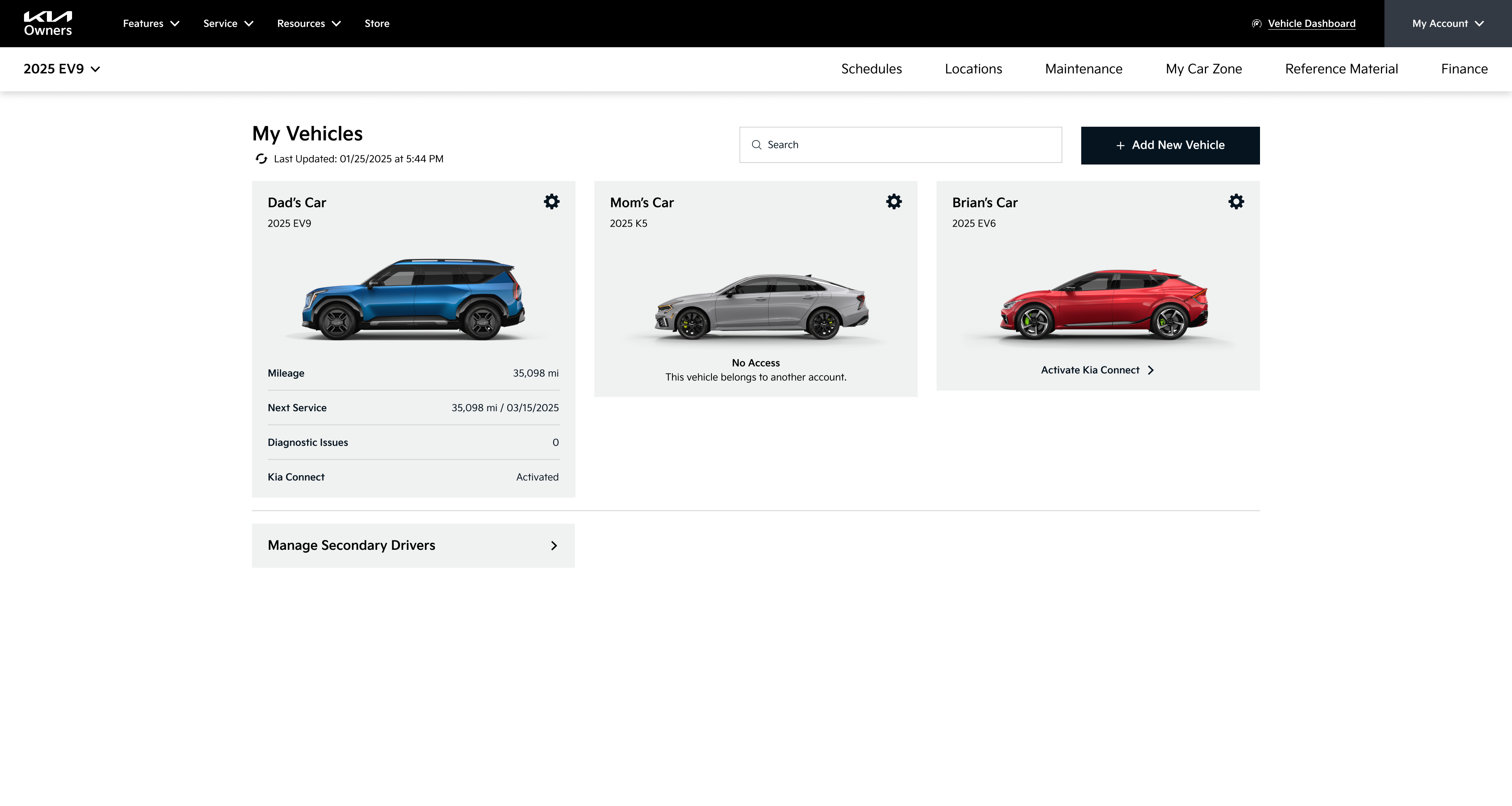
- Modular dashboard approach allowing for scalability, easily responsive between screen sizes, quick scanning for users, and establishing a modern design look and feel
- Brought remote commands directly into the dashboard instead of a separate section, removing clicks to access and highlighting easy use and state visibility of each remote command
- Grouping content and actions by category to help Kia Owners find what they need when they need it: controls, maintenance, emergency, and general owner resources
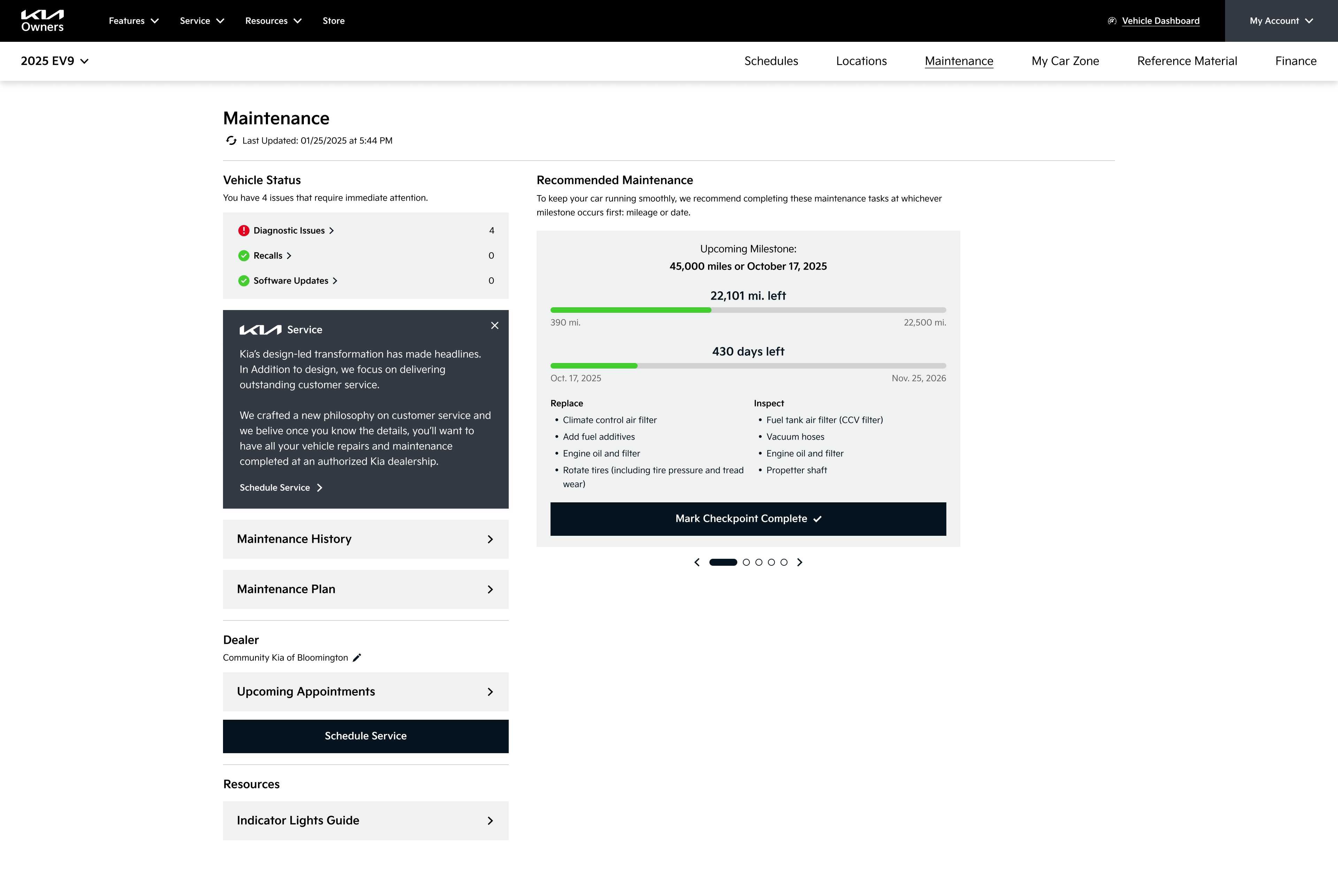
- Improved “Schedule Service” flow to remember contextual information, making scheduling a service quicker and easier without asking for redundant information every time
- Replaced unclear language with layman’s terms for error flows (ex: “Account Reprovisioned” became “Activate Kia Connect” with clear pathways to proceed on web or in the app)
- Add contextual definitions in layman’s terms to make alerts and schedules more clear, with less questions about “what is this, what does this mean, what am I actually doing”
Before: Not mobile friendly, outdated designs, information hierarchy doesn’t prioritize main actions, interactions are inconsistent with the Owner’s App which functions as a remote for most of these actions.
After: Prioritized mobile design, matched and improved interactions established in the Owner’s app, modern design with Kia’s updated branding, and modular blocks to smoothly adapt as Kia Connect capabilities grow and change.





Final Prototype: Post-Login
Final Prototype: Create Account Flow
Kia Connect Store
The Store was a unique problem to solve. Originally there were two completely separate stores: one unauthenticated experience linked from the main navigation, and one authenticated experience linked from the dashboard side navigation. When authenticated it was difficult to find your way back to the unauthenticated store, but each store had different offerings and a very different look and feel.
The Kia Connect Store was a relatively new addition and a high priority for the business. We wanted to make sure this experience worked - for the business as a revenue stream, and as an educational and easy to use experience for users. The store should be an area of exposure of additional features that could benefit or improve the experience of Kia Owners. So let’s make it feel familiar to established ecommerce practices, match their mental expectations, and work across all authentication states!
(Some of the) Strategic Improvements:
- Combined into one unified and consistent store experience for both pre- and post-authentication
- This meant one “Store” link in the navigation!
- Removed the product dropdown list from the navigation, focusing on improving the store landing page for ecommerce scaling as new products are added
- Required product detail pages for all products. Previously, the post-login store did not have PDPs, but the pre-login store did
- Small PDP updates to make them work post-login without a heavy lift: maintain a purchase button pre-login (call to action to log in to purchase), and show price when authenticated
- Subtle but crucial differences between pre- and post-login states: purchase button language, cart visibility
- Purchase button logic reflected the login state: either log in to purchase, or purchase now
- Made recommendations to add filters and categories in the future as more products, something that was not feasible at this point but was strongly recommended for a happy and smooth experience
Before: Inconsistent store screens that were difficult to take action to complete a purchase.
Before: Unauthenticated store landing.
Before: Authenticated store landing.
After: Consistent store experiences that can be accessed through the same interaction, pre- and post-authentication. Unauthenticated users are prompted to log in to purchase an item, while authenticated users are able to view the price and initiate a purchase from this page.

Final Prototype: Kia Connect Store
Landing page for “Check Kia Connect Availability”
Results
The Kia Owners’ team used their own development team for this project, and as of December 2025 this work (very sadly) still is not live.
- The Kia Connect Availability experience IS live and we’ve received great feedback from the call center team, sharing that the new experience is easier to use and understand!
- The client loved working with us so much that they were pursuing additional scopes with us before this project had officially wrapped! The work we delivered made them eager to see the full site redesigned.
Testimonials
The new ‘Kia Connect Availability’ page is perfect and [CourtAvenue] is a delight to work with. Great work! I appreciate everyone’s support, from research, design, developing, managing, and testing...your hard work and dedication doesn’t go unnoticed.”
- Nadia Haggie, Kia Owners
Kenzie, I had the chance to go through Owners and a bunch of other Kia work yesterday with the team. Just wanna thank you for all of your brilliant work and collaboration! The team really respects your priority to organize, prioritize, and structure communications. Thank you for all of your contributions. You’re awesome!”
- Michael Stich, CourtAvenue Partner
Messaging updates if Kia Connect is not available
Form stays visible to easily check a different vehicle
Results page for vehicles with Kia Connect showcases all the available features with paths to start a free trial.
Left panel shows the entered vehicle

Making over the Kia Owner’s site
Kia USA
•
2024
web design
wireframing
prototyping
site audit
competitive audit
navigation
Making over the Kia Owner’s site
Kia USA
•
2024
Team
Experience Strategy/UX: Kenzie Green
UI: Morgan Bennett, Brian Song
Copy: Coral Robertson
Account: Hayley Funk, Kelli Owens, Caleb Barbara Hudson
PM: Rob Ferrante
Abstract
Kia.com received a full makeover with continued love and care over a few years thanks to our dedicated Kia team, but this left the Kia Owners’ section of the site feeling disconnected, outdated, and in need of a little TLC. This project allowed us to take a giant step forward in modernizing and creating a connected and easier-to-use experience - one that owners of Kia vehicles deserve, and one that allows Kia to continue to provide value to customers after a major vehicle purchase.
The Ask
Redesign the Kia Owner’s Website to be consistent with kia.com.
Problems to Solve
Creating Consistency out of Disconnected Experiences
There were four digital experiences with disconnected designs: kia.com, kia.com/owners, the Kia Owners app, and the infotainment dashboard in-vehicle. We needed to match the kia.com designs as much as possible, while considering the established designs and patterns of the app and infotainment center that owners frequently engage with.
Limited Development Capabilities
Due to time, budget, and resourcing, we were limited to reusing existing components as much as possible. We were working with a development team that sometimes struggled with new interactions and complex designs, so we had to work very closely with the team to stay within their capabilities while continuing to push the design and experience to be as good as it could be.
The Work
Site Audit
To set up the redesign for success, we first evaluated all in-scope pages (and definitely inspected out-of-scope pages to get the full picture) to:
- Identify key themes to address
- Match existing components from kia.com to sections of the Owner’s site
- Bring awareness to major usability and accessibility issues, using it as an opportunity to educate the client on why they’re important and how to avoid these issues moving forward
We used this work to lead a discussion with our clients to collect their feedback on their current site experience. We wanted to collect as much information as possible - what is working? What isn’t working? What do you hear from the call center? What information do you have from feedback or research?
Making the sausage in FigJam: identifying content goals, noting opportunities for improvement, and brainstorming how we can use existing components.
Examples of what we shared: key findings for UX education and consideration for ongoing experience improvements. In-depth examples were shared in the appendix to reference.
Competitive Audit
As part of our initial strategy and redesign preparation we evaluated the owners’ web experiences of competitor OEMs to identify trends, potential owner expectations, and standards, with a focus on navigation, IA, and entry points to owner-specific content.
We looked at tech-forward OEMs, Tesla and Rivian, to explore what users refer to as “best in class” and find inspiration to continue to establish Kia as a tech-forward and more luxurious brand.

Redesign
The redesign may have been limited in scope and capabilities, but we were determined to make dramatic improvements. We were intentional to educate the clients along the way, explaining rationale and sharing UX education, empowering them to continue advocating for a better experience.
Navigation
We had pitched an updated navigation to this team a few times, so we took this opportunity to give it some much needed updates!
Using our past work trying to pitch navigation improvements, the findings of the competitive analysis, data on the most visited pages on the site, the knowledge of the existing kia.com navigation, and an exercise of breaking down the current site map and putting it back together, I proposed some navigation improvements.
Before: Navigation had become a dumping ground for links, broken, and was difficult to move between the authenticated portal and other resources on the site.
Before: Primary navigation for the website.
Before: Navigation for the authenticated portal. A completely different navigation strategy, adding a side bar and removing the main nav. This worked in the dashboard, but made it difficult to to access the valuable unauthenticated content once a user logs in.
After: We wanted to create an in-dashboard navigation solution that worked throughout the rest of the site: maintaining easy access to non-dashboard content, allowing clear paths back to other pages, while bringing forward the in-dashboard navigation paths.
We proposed a solution that matched the kia.com L2 navigation design. Kia.com uses an L2 navigation on vehicle model pages. This design worked as a quick solution, allowing us to reuse designs from kia.com (one of the key asks of the project), and making an improvement to the usability and IA of the owner’s site.
After: Primary navigation for the website.
After: Portal navigation, seamlessly connected to the primary navigation and matching interactions that have been established on kia.com.
Pre-Login Experience
There were six key screens in-scope for the pre-login/unauthenticated section of the site. This work was relatively straightforward and focused on reskinning the designs to match kia.com, with some strategic content improvements on pages that warranted it.
(Some of the) Strategic Improvements:
- Prioritizing valuable and frequently visited content through additions like quick links below the hero on the homepage
- Improved “Check Availability” experience, focusing on clearly defining what is or isn’t available on a specific vehicle
- Introduced a component for feature-specific pages that updates within the page, allowing quick availability checks without being sent to a new page
- Removing all broken links and dead ends. Replaced with content focused on helping owners find the resources they need for their vehicle, such as scheduling maintenance.
- Clear value propositions and feature communications so users can easily understand what benefits are available for Kia owners
- Extra emphasis on business priorities that offer value for owners:
- The Kia Access App, offering access to even more benefits on the go
- Kia Connect, a monthly subscription that contains the bulk of exclusive features for owners
- The Kia Connect Store, a new business venture that offers even more features
- Direct “How to Activate/Set Up” steps for features, especially Kia Connect, which is the primary source of owner benefits and offers a free trial
Wireframe examples for the homepage and the “Check Kia Connect Availability” screens.
Creative collaboration is a critical step of any project. The magic happens when different perspectives and ideas come together, push each other, and meld into one. Morgan Bennet, my UI counterpart, and I had a well-established working relationship at this point. Although this project was focused on reusing existing components wherever possible, there are always opportunities to push and build on each other’s work. She had great ideas on how to combine the “Check Availability” screens and we were able to elegantly consolidate this flow to keep the “Kia Connect Not Available” messaging on the “select your vehicle” screen.

Final Prototype: Pre-Login
Post-Login Experience
The post-login experience was more dashboard-focused, requiring us to deviate from the “reuse established kia.com components” approach and propose new concepts, looking to highly regarded tech-froward OEMs like Tesla and Rivian for inspiration. There were a lot of small experience and logic improvements that needed to be made which we addressed while breaking down, pulling apart, and putting back together the features of the experience.
(Some of the) Strategic Improvements:
- Modular dashboard approach allowing for scalability, easily responsive between screen sizes, quick scanning for users, and establishing a modern design look and feel
- Brought remote commands directly into the dashboard instead of a separate section, removing clicks to access and highlighting easy use and state visibility of each remote command
- Grouping content and actions by category to help Kia Owners find what they need when they need it: controls, maintenance, emergency, and general owner resources
- Improved “Schedule Service” flow to remember contextual information, making scheduling a service quicker and easier without asking for redundant information every time
- Replaced unclear language with layman’s terms for error flows (ex: “Account Reprovisioned” became “Activate Kia Connect” with clear pathways to proceed on web or in the app)
- Add contextual definitions in layman’s terms to make alerts and schedules more clear, with less questions about “what is this, what does this mean, what am I actually doing”
Before: Not mobile friendly, outdated designs, information hierarchy doesn’t prioritize main actions, interactions are inconsistent with the Owner’s App which functions as a remote for most of these actions.
After: Prioritized mobile design, matched and improved interactions established in the Owner’s app, modern design with Kia’s updated branding, and modular blocks to smoothly adapt as Kia Connect capabilities grow and change.


Final Prototype: Post-Login
Final Prototype: Create Account Flow
Kia Connect Store
The Store was a unique problem to solve. Originally there were two completely separate stores: one unauthenticated experience linked from the main navigation, and one authenticated experience linked from the dashboard side navigation. When authenticated it was difficult to find your way back to the unauthenticated store, but each store had different offerings and a very different look and feel.
The Kia Connect Store was a relatively new addition and a high priority for the business. We wanted to make sure this experience worked - for the business as a revenue stream, and as an educational and easy to use experience for users. The store should be an area of exposure of additional features that could benefit or improve the experience of Kia Owners. So let’s make it feel familiar to established ecommerce practices, match their mental expectations, and work across all authentication states!
(Some of the) Strategic Improvements:
- Combined into one unified and consistent store experience for both pre- and post-authentication
- This meant one “Store” link in the navigation!
- Removed the product dropdown list from the navigation, focusing on improving the store landing page for ecommerce scaling as new products are added
- Required product detail pages for all products. Previously, the post-login store did not have PDPs, but the pre-login store did
- Small PDP updates to make them work post-login without a heavy lift: maintain a purchase button pre-login (call to action to log in to purchase), and show price when authenticated
- Subtle but crucial differences between pre- and post-login states: purchase button language, cart visibility
- Purchase button logic reflected the login state: either log in to purchase, or purchase now
- Made recommendations to add filters and categories in the future as more products, something that was not feasible at this point but was strongly recommended for a happy and smooth experience
Before: Inconsistent store screens that were difficult to take action to complete a purchase.
Before: Unauthenticated store landing.
Before: Authenticated store landing.
After: Consistent store experiences that can be accessed through the same interaction, pre- and post-authentication. Unauthenticated users are prompted to log in to purchase an item, while authenticated users are able to view the price and initiate a purchase from this page.

Final Prototype: Kia Connect Store
Results
The Kia Owners’ team used their own development team for this project, and as of December 2025 this work (very sadly) still is not live.
- The Kia Connect Availability experience IS live and we’ve received great feedback from the call center team, sharing that the new experience is easier to use and understand!
- The client loved working with us so much that they were pursuing additional scopes with us before this project had officially wrapped! The work we delivered made them eager to see the full site redesigned.
Testimonials
The new ‘Kia Connect Availability’ page is perfect and [CourtAvenue] is a delight to work with. Great work! I appreciate everyone’s support, from research, design, developing, managing, and testing...your hard work and dedication doesn’t go unnoticed.”
- Nadia Haggie, Kia Owners
Kenzie, I had the chance to go through Owners and a bunch of other Kia work yesterday with the team. Just wanna thank you for all of your brilliant work and collaboration! The team really respects your priority to organize, prioritize, and structure communications. Thank you for all of your contributions. You’re awesome!”
- Michael Stich, CourtAvenue Partner
Landing page for “Check Kia Connect Availability”
Messaging updates if Kia Connect is not available
Form stays visible to easily check a different vehicle
Results page for vehicles with Kia Connect showcases all the available features with paths to start a free trial.
Left panel shows the entered vehicle
