
Creating an app to support students studying abroad
API Abroad
•
2023
app design
wireframing
prototyping
information architecture
design system
notification strategy
Team
Experience Strategy/UX: Kenzie Green, supported by Kayla Brodman
UI: Ayana Atha, Jim McArthur, supported by Rosie McGuire
Copy & Content: Rachel Kirkwood, Emily Leisl
PM: Cheryl Gilligan
Abstract
API Abroad offers premium study abroad experiences, but their support for students relied on PDFs, slide decks, and links, all hidden in emails. What if we consolidated their touch points and met students where they are, on their phones, by supporting their end-to-end journey in an app? How might we improve student journeys from onboarding and preparing for their trip, to in-country support, to post-trip reviews, and even booking another trip?
The Ask
Create a mobile app for students to use before, during, and after their study abroad trip. Address known pain points and problems throughout their journey.
Problems to Solve
Content for applications, onboarding, and on-site resources were scattered throughout emails, paper documents, PDFs…it was a mess for already busy students to keep track of.
Gathering content in one place would make it easier for students and parents to find what they need when they needed it and call attention to urgent matters, like hitting an application deadline or picking your roommate.
Students have vastly different needs at each stage of their adventure abroad.
This makes it crucial that we understand and meet their needs by showing them the right content at each step along the way.
The Work
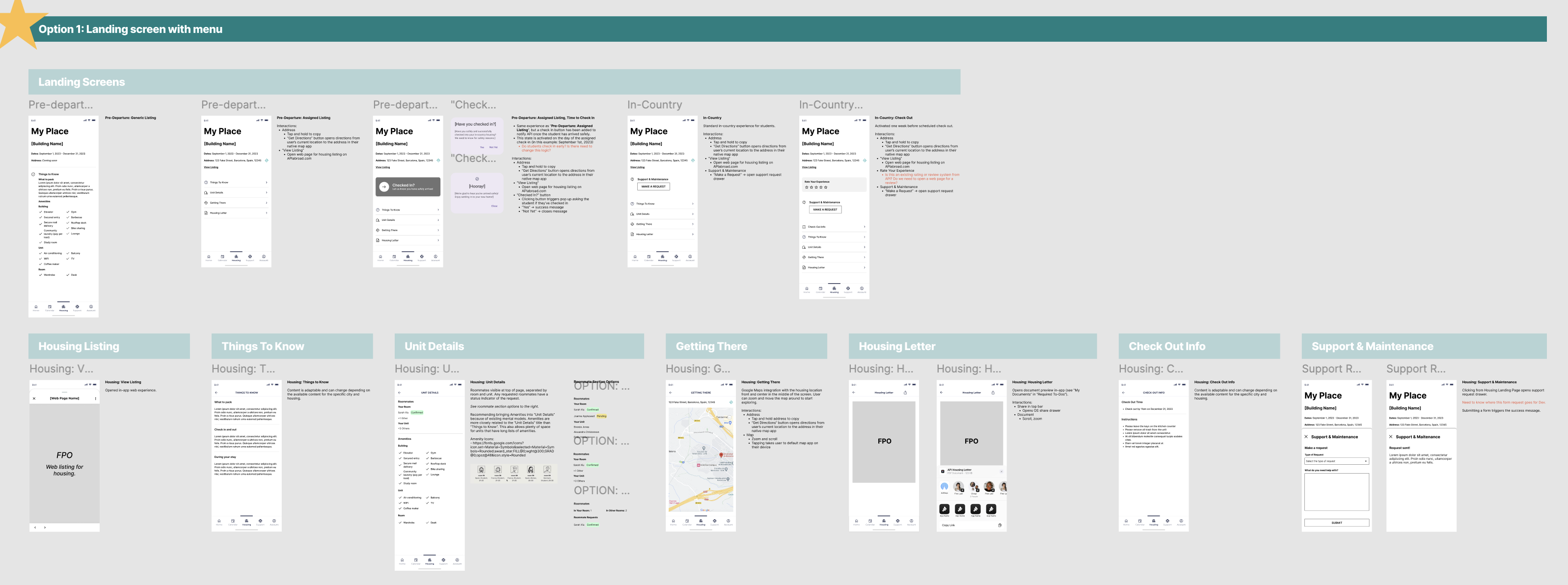
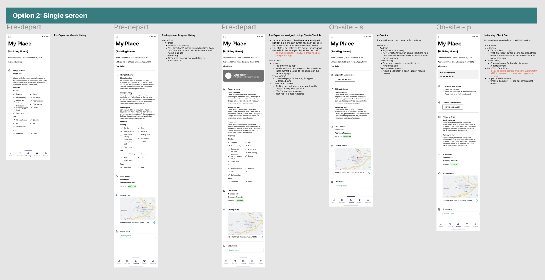
App Map
After kick off and some discovery, we started with the essential basics: an app map.
This gave us a structure to gain alignment with the client, inform the project plan, and methodically start working through all the screens we’d need to create. To this day we still reference this app map internally because it played such a crucial role in helping us see both the macro and micro as the project progressed. It ended up having some beautiful iterations that showed the progress from concept → wire strategy → designs.
Version Zero: initial concept. Intent to communicate ultra-high-level structure and think through how we’ll bring all of the requirements together in one experience. A conversation piece to discuss our concept with the client and gain alignment before moving forward.
Wire Version: a little more sophisticated, a little more structured with wireframes and more detailed content needs. Thinking through the various states needed.
Wire Version / Zoomed In: where the different needs and states for the home page start to come to life. This is the central hub of the app and sees the most changes across the student journey.
End of Project: as each section got designed out, we’d replace the wires with the designs in the app map. We referenced this page so much more than I expected. It became a tool for checking design patterns and consistencies, prototyping, explaining states and intra-app connections, and allowed us to easily share a view of the completed work with the client and colleagues within our agency.
Taking Content out of Spreadsheets and Slide Decks
Calendar
There are multiple calendars and types of events that students need to keep track of: their host university’s calendar, their program calendar, US holidays and national holidays for the country they’re visiting, and study abroad events that could range from mandatory onboarding sessions to optional paid excursions for the weekend.
Before: Calendars were kept in spreadsheets and emailed to students. Extras, like fun events and excursions, had to be sought out by the student on the API website.
After: All relevant calendars are consolidated in one experience where the user can toggle them on or off to customize their view. All of their study abroad events can be found in one place, added to their personal Apple or Google calendar, and can sign up and pay for an “add-on” event directly through the event detail page.
Wireframe Prototype
Final Designs
Orientation
Orientation is a collection of videos and written content intended to arm students with the information they need to have a successful study abroad experience. From cultural customs, to safety, to what to expect from their new university and classes, this content is important and must be completed by the student.
Before: Students were sent slide decks and miscellaneous documents through email. Notice a pattern? They also had to attend a required orientation day for one of their first days in their new country, where they would sit in a classroom all day to watch an orientation presentation.
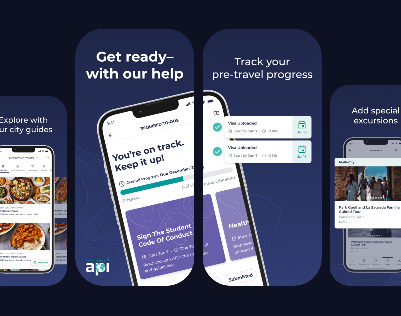
After: All Orientation content is a combination of videos and written content, fully housed in-app and easily accessible if they need to revisit any information once they’re in-country. Eager students can get a head start and review their Orientation information early, while last-minute students can tackle their content in the airport or on public transit so they can jump right into their study abroad experience when they arrive. Those who need a nudge to go through Orientation will see task reminders in “Onboarding”.
Orientation: wireframe concepts showing different explorations for the content templates
Orientation: final designs
Onboarding
Prepping to go abroad requires completing forms, gathering documents, and plenty of unavoidable but necessary tasks for legal purposes. There’s no getting around it - students and guardians need to fill out consent forms and ensure their passport is up to date before departing for their trip. But how could we make these menial tasks a little easier?
Before: Onboarding tasks were completed primarily on the API website, which was designed as a desktop-first experience. Being accessible through one online location was great compared to having to hunt through emails, but there were opportunities to: make key actions clearer, emphasize due dates, make the design more adaptable for various task quantities, and provide additional context and help students through key tasks like acquiring a passport.
After: We focused on clear next steps and deadlines to help students move forward and complete tasks on time. Tasks can be completed entirely within the app, taking advantage of native features like the phone camera to easily submit tasks like photos of their ID and passport photos.
Onboarding: different concepts explored during the ideation phase.
Onboarding: final designs
City Guides
One of the perks of API’s study abroad programs is their carefully curated city guides for students, providing them with recommendations for everything from pharmacies and coffee shops to shopping and cultural landmarks.
Before: City Guides were shared as a PDF or an email. The kind of document that you open once, then forget about and never open again.
After: We turned City Guides into an interactive in-app experience, modeled after well-established patterns like Google Maps saved location lists. This allows students to see what’s near their current location, have permanent pins to places like their housing and university, and get directions through their native map app to any location in the city guide.
City Guides: wireframe concept explorations and overall recommendation.
Onboarding: final designs
Giving students what they need, when they need it.
Student’s needs vary greatly across the three main phases of their trip:
1
Prep: Applications, forms, to-do lists. Picking housing and roommate(s). Signing up for classes. Buying plane tickets. Choosing add-ons, like weekend excursions. Packing. Completing orientation. Getting ready for their new adventure!
2
On-Site: Attending classes. Exploring! Reporting maintenance issues with housing. Checking their calendar, attending local and university events. Staying safe during local emergencies.
3
Post-Trip: Requesting class records. Submitting reviews. Scheduling another trip with API!
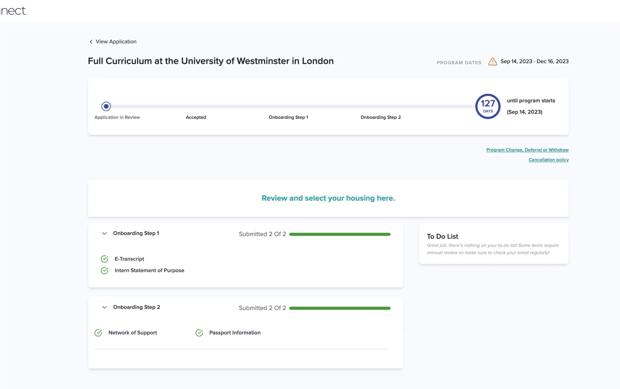
App Home
The home page of the app sees the most change throughout the student’s journey and is the more prominent example of giving them what they need, when they need it.
The components shown, component state, and order of components will all adapt to the student’s stage of their journey. Changes are triggered by clear actions, like paying a deposit, application acceptance, and the experience start date.
0
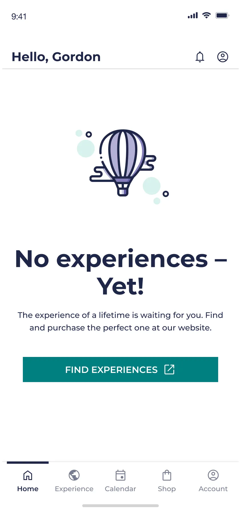
Empty State: User has downloaded the app, but purchases have been made and no applications have been submitted.
For MVP, the application and purchasing experiences were fully online and the app purpose was to be a companion for students who have applied for and have been accepted to a program.
1
Prep: Students’s application for their program is being processed.
1
Prep: Student has been accepted to their program, hooray! 🎉
2
On-Site: The student’s experience has officially begun and they’re in a new country away from home.
3
Post-Trip: This student has completed a program with API
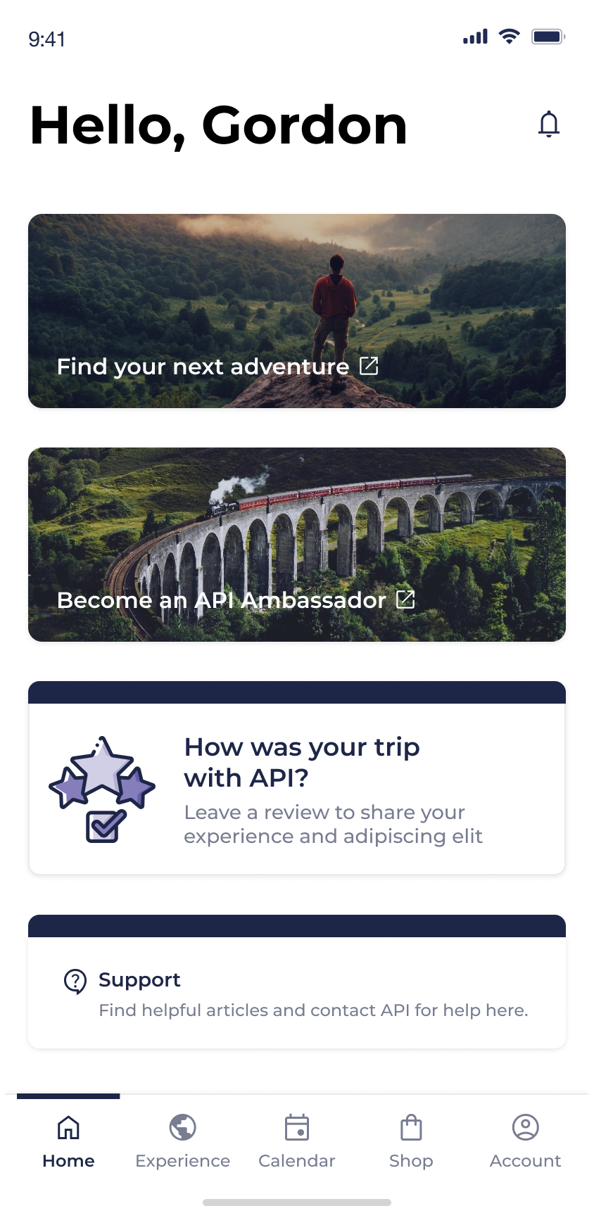
By the way…a student can be in multiple experiences at the same time.
At the end of the project we learned of a new scenario - which will often happen, no matter how thorough you try to be with discovery up front - that a student could have multiple experiences at once.
This posed the question: how could we allow students to clearly and easily access multiple experiences, which could be in different states with vastly different content, within the constraints of the designs that we’ve spent months working on?
We knew this change would primarily impact two screens: “Home” and “Experiences”, since they’re the front door to most of the content.
We explored existing examples to find inspiration and mocked up some potential solutions, weighing the pros and cons of each one:
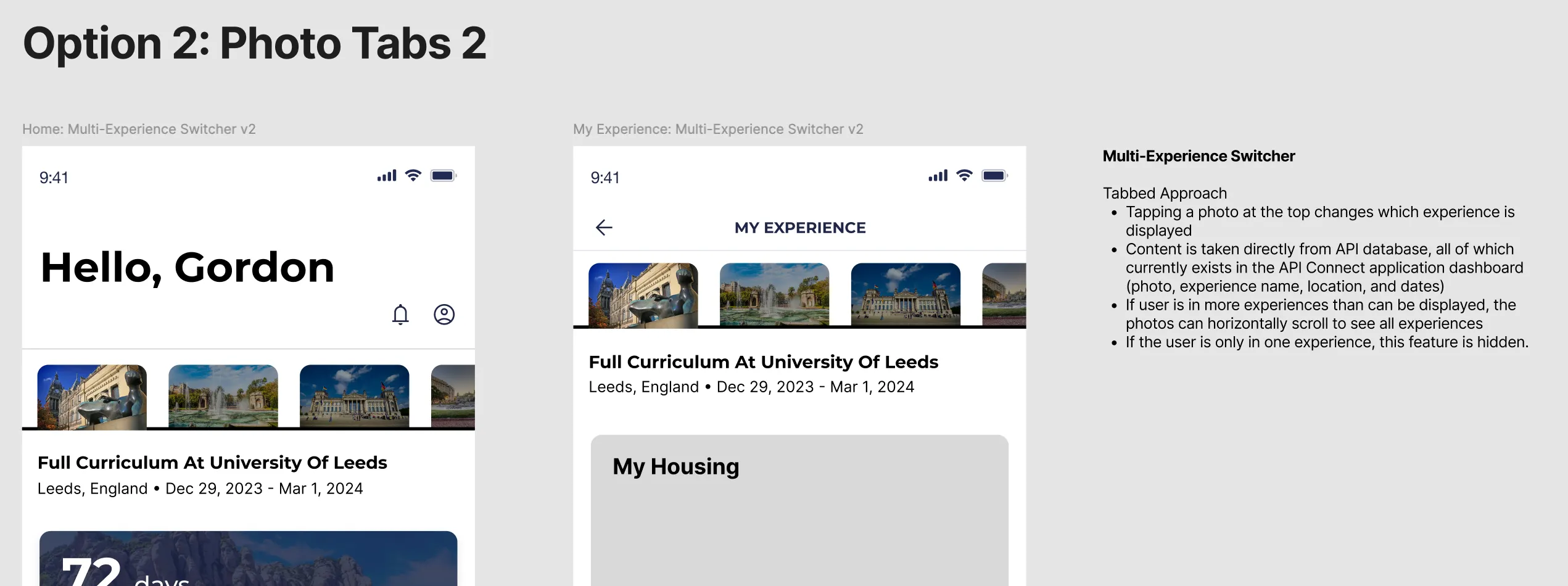
We landed on a variation of Option 6: a card carousel at the top of the page, where the actively selected card dictates the content shown on the screen. This option allowed us space to show helpful content to identify the experience, emphasized a single experience at a time while using a familiar “peek” interaction, and worked nicely as a full-width card for single experiences!
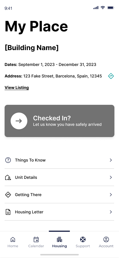
Housing
Housing is another area where student needs will vary, but to less extreme lengths than the needs of the “Home” experience. The “Housing” states reflect smaller, but still important, content need: knowing what to pack to bring on your trip before you leave, reporting maintenance and roommate issues while living in your new housing, and knowing how to check out before you leave to return home.
App Map Content Concepts
No active housing
Pre-departure
On-site
Departure
Wireframes
Final Designs
Pre-departure
Day of Check In
On-site
Check Out

Results
Final Prototype

They (student onboarding team) are all over the moon about the experience. They said it will save them so much time because it is so clear.”
Reflection
Wishing we pushed for upfront user research.
The student journey was everything for this project. Deciding what states of the app were needed, what to prioritize for each state, what content users actually needed… We partnered very closely with the API team that interacts directly with students and knows their needs inside out, but if I could do this all over I would’ve pushed to start this project with proper primary research to inform a journey map. This journey map would be the backbone of the project and ultimately would’ve saved us time by informing design decisions.
Clients and subject matter experts are your best friends.
At this point in my agency career, I’m very comfortable going into new territory where I know nothing and need to get up to speed quickly. I never studied abroad, haven’t worked in this industry, and had no research - but I was responsible for creating the IA, strategy, and all of the wireframes for this brand new app.
So what did I do?
I was curious. I asked questions. I wasn’t afraid to not know the answer, but I made sure to learn and figure it out. The client gave us access to all the content students receive, so I studied. If I was a student, what other information would I need? I played the role of student to the best of my ability to fill in those gaps. When the client gave us documentation and guidelines for how to approach a section, I (respectfully) poked holes to make sure I understood it better. I met with employees who knew the students and their needs and learned as much as I could. I did guerrilla research with colleagues and friends who had studied abroad.
This effort to understand the client and their problems went a long way to build trust and create a great relationship with a client that was a hard nut to crack. The more I worked to understand their product, the more they trusted my designs, and the better the work was.
Was this perfect? Nope. But we made lemonade with everything we could.
Creating an app to support students studying abroad
API Abroad
•
2023
app design
wireframing
prototyping
information architecture
design system
notification strategy
Team
Experience Strategy/UX: Kenzie Green, supported by Kayla Brodman
UI: Ayana Atha, Jim McArthur, supported by Rosie McGuire
Copy & Content: Rachel Kirkwood, Emily Leisl
PM: Cheryl Gilligan
Abstract
API Abroad offers premium study abroad experiences, but their support for students relied on PDFs, slide decks, and links, all hidden in emails. What if we consolidated their touch points and met students where they are, on their phones, by supporting their end-to-end journey in an app? How might we improve student journeys from onboarding and preparing for their trip, to in-country support, to post-trip reviews, and even booking another trip?
The Ask
Create a mobile app for students to use before, during, and after their study abroad trip. Address known pain points and problems throughout their journey.
Problems to Solve
Content for applications, onboarding, and on-site resources were scattered throughout emails, paper documents, PDFs…it was a mess for already busy students to keep track of.
Gathering content in one place would make it easier for students and parents to find what they need when they needed it and call attention to urgent matters, like hitting an application deadline or picking your roommate.
Students have vastly different needs at each stage of their adventure abroad.
This makes it crucial that we understand and meet their needs by showing them the right content at each step along the way.
The Work
App Map
After kick off and some discovery, we started with the essential basics: an app map.
This gave us a structure to gain alignment with the client, inform the project plan, and methodically start working through all the screens we’d need to create. To this day we still reference this app map internally because it played such a crucial role in helping us see both the macro and micro as the project progressed. It ended up having some beautiful iterations that showed the progress from concept → wire strategy → designs.
Version Zero: initial concept. Intent to communicate ultra-high-level structure and think through how we’ll bring all of the requirements together in one experience. A conversation piece to discuss our concept with the client and gain alignment before moving forward.
Wire Version: a little more sophisticated, a little more structured with wireframes and more detailed content needs. Thinking through the various states needed.
Wire Version / Zoomed In: where the different needs and states for the home page start to come to life. This is the central hub of the app and sees the most changes across the student journey.
End of Project: as each section got designed out, we’d replace the wires with the designs in the app map. We referenced this page so much more than I expected. It became a tool for checking design patterns and consistencies, prototyping, explaining states and intra-app connections, and allowed us to easily share a view of the completed work with the client and colleagues within our agency.
Taking Content out of Spreadsheets and Slide Decks
Calendar
There are multiple calendars and types of events that students need to keep track of: their host university’s calendar, their program calendar, US holidays and national holidays for the country they’re visiting, and study abroad events that could range from mandatory onboarding sessions to optional paid excursions for the weekend.
Before: Calendars were kept in spreadsheets and emailed to students. Extras, like fun events and excursions, had to be sought out by the student on the API website.
After: All relevant calendars are consolidated in one experience where the user can toggle them on or off to customize their view. All of their study abroad events can be found in one place, added to their personal Apple or Google calendar, and can sign up and pay for an “add-on” event directly through the event detail page.
Wireframe Prototype
Final Designs
Orientation
Orientation is a collection of videos and written content intended to arm students with the information they need to have a successful study abroad experience. From cultural customs, to safety, to what to expect from their new university and classes, this content is important and must be completed by the student.
Before: Students were sent slide decks and miscellaneous documents through email. Notice a pattern? They also had to attend a required orientation day for one of their first days in their new country, where they would sit in a classroom all day to watch an orientation presentation.
After: All Orientation content is a combination of videos and written content, fully housed in-app and easily accessible if they need to revisit any information once they’re in-country. Eager students can get a head start and review their Orientation information early, while last-minute students can tackle their content in the airport or on public transit so they can jump right into their study abroad experience when they arrive. Those who need a nudge to go through Orientation will see task reminders in “Onboarding”.
Orientation: wireframe concepts showing different explorations for the content templates
Orientation: final designs
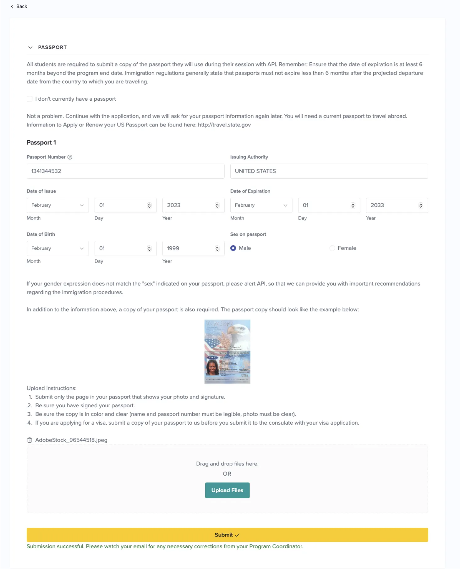
Onboarding
Prepping to go abroad requires completing forms, gathering documents, and plenty of unavoidable but necessary tasks for legal purposes. There’s no getting around it - students and guardians need to fill out consent forms and ensure their passport is up to date before departing for their trip. But how could we make these menial tasks a little easier?
Before: Onboarding tasks were completed primarily on the API website, which was designed as a desktop-first experience. Being accessible through one online location was great compared to having to hunt through emails, but there were opportunities to: make key actions clearer, emphasize due dates, make the design more adaptable for various task quantities, and provide additional context and help students through key tasks like acquiring a passport.
After: We focused on clear next steps and deadlines to help students move forward and complete tasks on time. Tasks can be completed entirely within the app, taking advantage of native features like the phone camera to easily submit tasks like photos of their ID and passport photos.
Onboarding: different concepts explored during the ideation phase.
Onboarding: final designs
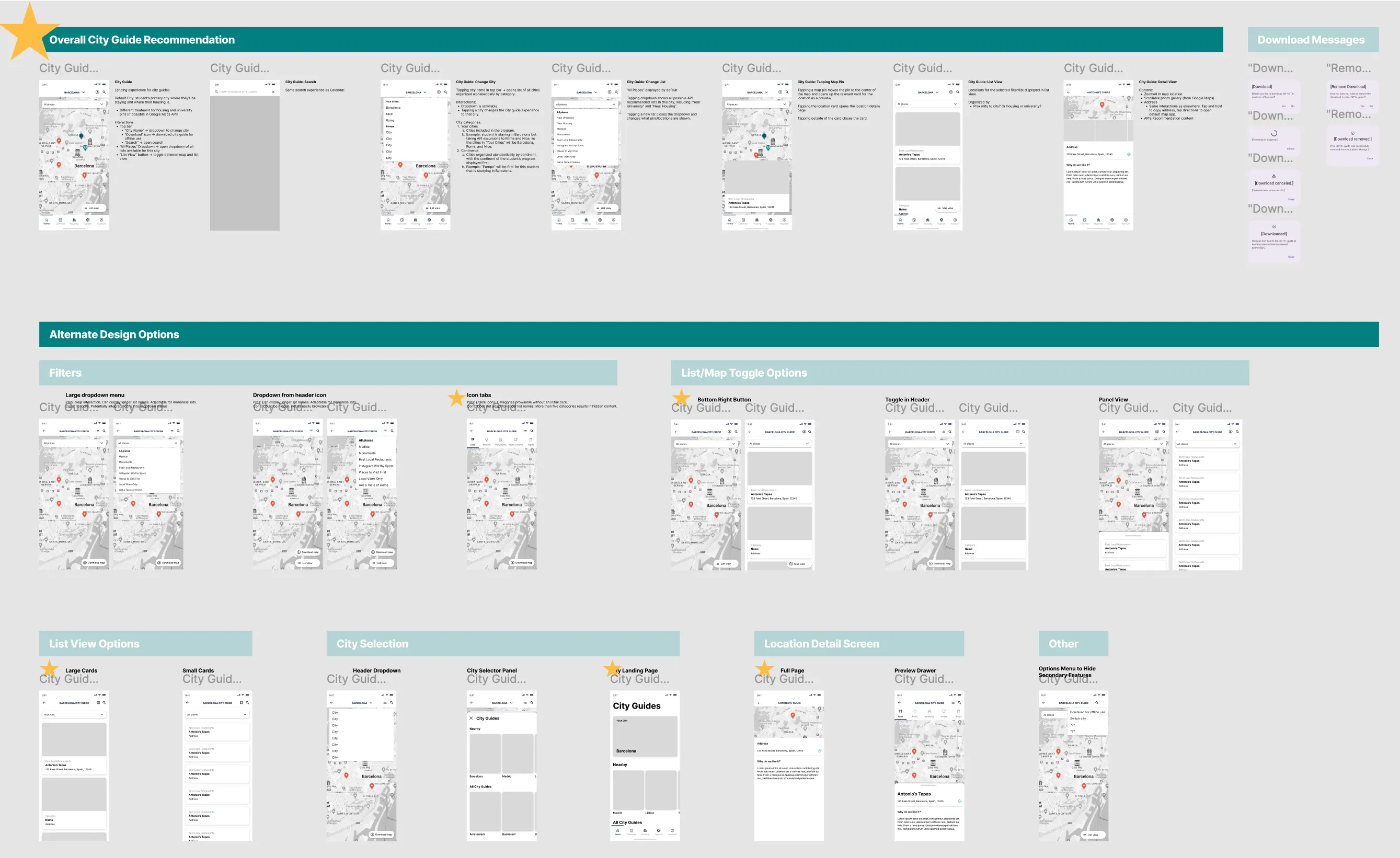
City Guides
One of the perks of API’s study abroad programs is their carefully curated city guides for students, providing them with recommendations for everything from pharmacies and coffee shops to shopping and cultural landmarks.
Before: City Guides were shared as a PDF or an email. The kind of document that you open once, then forget about and never open again.
After: We turned City Guides into an interactive in-app experience, modeled after well-established patterns like Google Maps saved location lists. This allows students to see what’s near their current location, have permanent pins to places like their housing and university, and get directions through their native map app to any location in the city guide.
City Guides: wireframe concept explorations and overall recommendation.
Onboarding: final designs
Giving students what they need, when they need it.
Student’s needs vary greatly across the three main phases of their trip:
1
Prep: Applications, forms, to-do lists. Picking housing and roommate(s). Signing up for classes. Buying plane tickets. Choosing add-ons, like weekend excursions. Packing. Completing orientation. Getting ready for their new adventure!
2
On-Site: Attending classes. Exploring! Reporting maintenance issues with housing. Checking their calendar, attending local and university events. Staying safe during local emergencies.
3
Post-Trip: Requesting class records. Submitting reviews. Scheduling another trip with API!
App Home
The home page of the app sees the most change throughout the student’s journey and is the more prominent example of giving them what they need, when they need it.
The components shown, component state, and order of components will all adapt to the student’s stage of their journey. Changes are triggered by clear actions, like paying a deposit, application acceptance, and the experience start date.
0
Empty State: User has downloaded the app, but purchases have been made and no applications have been submitted.
For MVP, the application and purchasing experiences were fully online and the app purpose was to be a companion for students who have applied for and have been accepted to a program.
1
Prep: Students’s application for their program is being processed.
1
Prep: Student has been accepted to their program, hooray! 🎉
2
On-Site: The student’s experience has officially begun and they’re in a new country away from home.
3
Post-Trip: This student has completed a program with API
By the way…a student can be in multiple experiences at the same time.
At the end of the project we learned of a new scenario - which will often happen, no matter how thorough you try to be with discovery up front - that a student could have multiple experiences at once.
This posed the question: how could we allow students to clearly and easily access multiple experiences, which could be in different states with vastly different content, within the constraints of the designs that we’ve spent months working on?
We knew this change would primarily impact two screens: “Home” and “Experiences”, since they’re the front door to most of the content.
We explored existing examples to find inspiration and mocked up some potential solutions, weighing the pros and cons of each one:
We landed on a variation of Option 6: a card carousel at the top of the page, where the actively selected card dictates the content shown on the screen. This option allowed us space to show helpful content to identify the experience, emphasized a single experience at a time while using a familiar “peek” interaction, and worked nicely as a full-width card for single experiences!
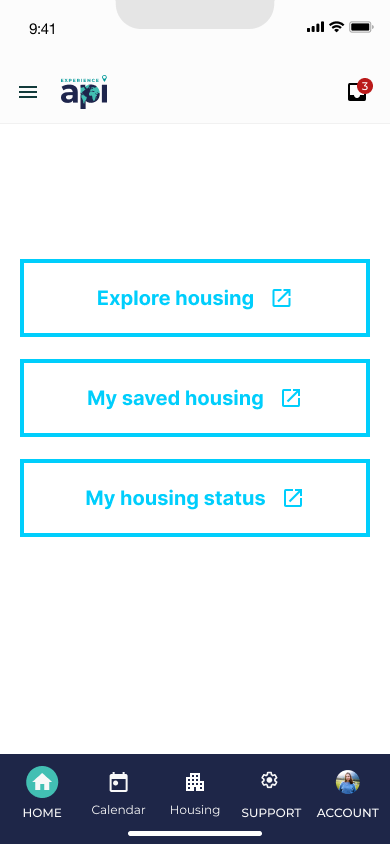
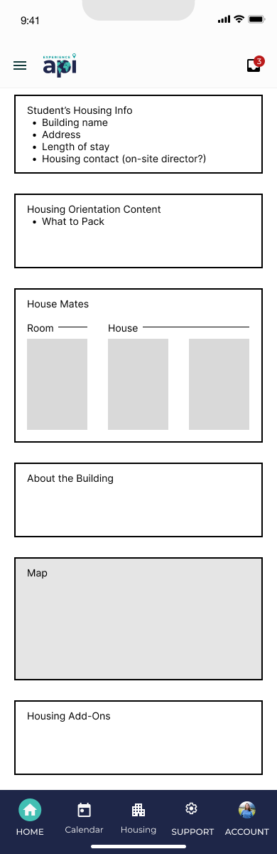
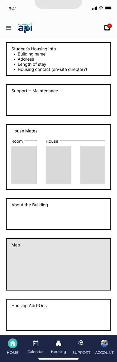
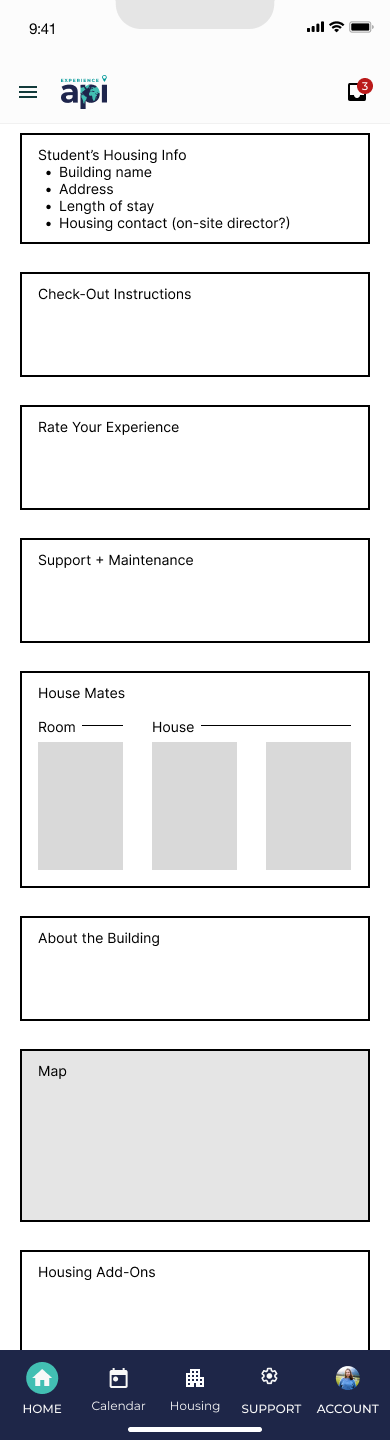
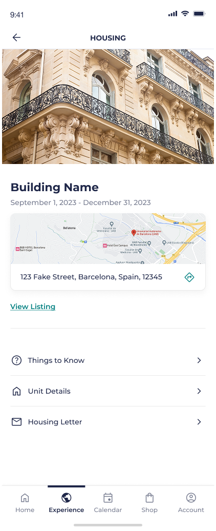
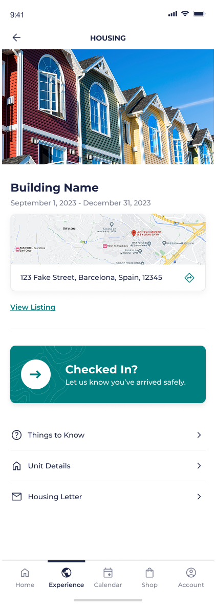
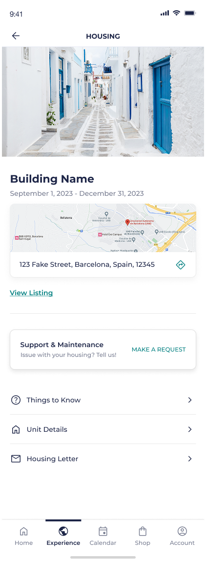
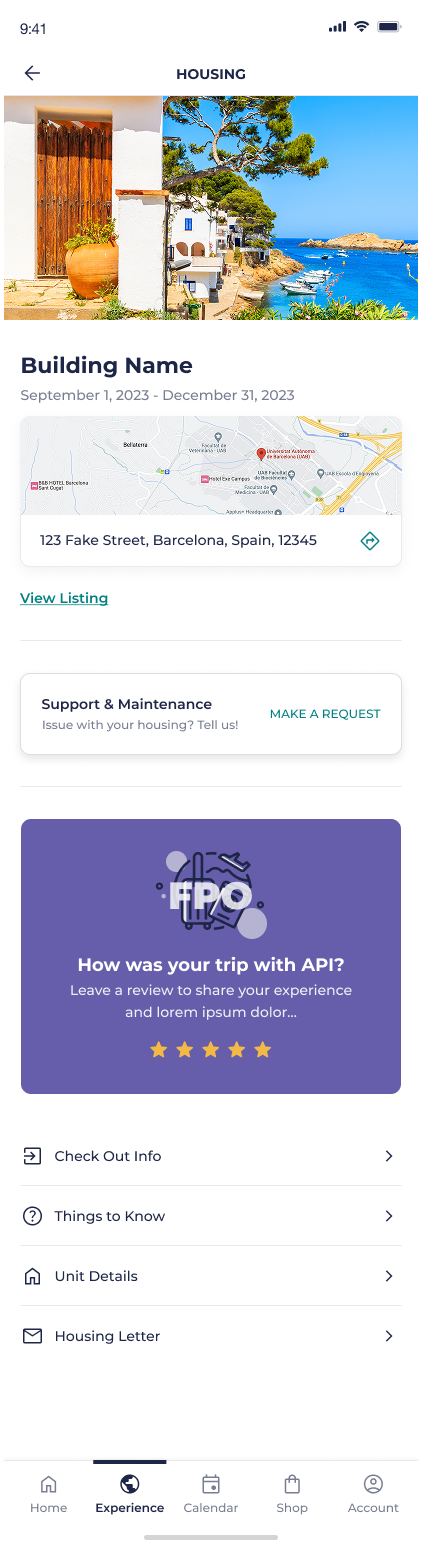
Housing
Housing is another area where student needs will vary, but to less extreme lengths than the needs of the “Home” experience. The “Housing” states reflect smaller, but still important, content need: knowing what to pack to bring on your trip before you leave, reporting maintenance and roommate issues while living in your new housing, and knowing how to check out before you leave to return home.
App Map Content Concepts
No active housing
Pre-departure
On-site
Departure
Wireframes
Final Designs
Pre-departure
Day of Check In
On-site
Check Out

Results
Final Prototype
They (student onboarding team) are all over the moon about the experience. They said it will save them so much time because it is so clear.”
Reflection
Wishing we pushed for upfront user research.
The student journey was everything for this project. Deciding what states of the app were needed, what to prioritize for each state, what content users actually needed… We partnered very closely with the API team that interacts directly with students and knows their needs inside out, but if I could do this all over I would’ve pushed to start this project with proper primary research to inform a journey map. This journey map would be the backbone of the project and ultimately would’ve saved us time by informing design decisions.
Clients and subject matter experts are your best friends.
At this point in my agency career, I’m very comfortable going into new territory where I know nothing and need to get up to speed quickly. I never studied abroad, haven’t worked in this industry, and had no research - but I was responsible for creating the IA, strategy, and all of the wireframes for this brand new app.
So what did I do?
I was curious. I asked questions. I wasn’t afraid to not know the answer, but I made sure to learn and figure it out. The client gave us access to all the content students receive, so I studied. If I was a student, what other information would I need? I played the role of student to the best of my ability to fill in those gaps. When the client gave us documentation and guidelines for how to approach a section, I (respectfully) poked holes to make sure I understood it better. I met with employees who knew the students and their needs and learned as much as I could. I did guerrilla research with colleagues and friends who had studied abroad.
This effort to understand the client and their problems went a long way to build trust and create a great relationship with a client that was a hard nut to crack. The more I worked to understand their product, the more they trusted my designs, and the better the work was.
Was this perfect? Nope. But we made lemonade with everything we could.
Creating an app to support students studying abroad
API Abroad
•
2023
app design
wireframing
prototyping
information architecture
design system
notification strategy
Creating an app to support students studying abroad
API Abroad
•
2023
Team
Experience Strategy/UX: Kenzie Green, supported by Kayla Brodman
UI: Ayana Atha, Jim McArthur, supported by Rosie McGuire
Copy & Content: Rachel Kirkwood, Emily Leisl
PM: Cheryl Gilligan
Abstract
API Abroad offers premium study abroad experiences, but their support for students relied on PDFs, slide decks, and links, all hidden in emails. What if we consolidated their touch points and met students where they are, on their phones, by supporting their end-to-end journey in an app? How might we improve student journeys from onboarding and preparing for their trip, to in-country support, to post-trip reviews, and even booking another trip?
The Ask
Create a mobile app for students to use before, during, and after their study abroad trip. Address known pain points and problems throughout their journey.
Problems to Solve
Content for applications, onboarding, and on-site resources were scattered throughout emails, paper documents, PDFs…it was a mess for already busy students to keep track of.
Gathering content in one place would make it easier for students and parents to find what they need when they needed it and call attention to urgent matters, like hitting an application deadline or picking your roommate.
Students have vastly different needs at each stage of their adventure abroad.
This makes it crucial that we understand and meet their needs by showing them the right content at each step along the way.
The Work
App Map
After kick off and some discovery, we started with the essential basics: an app map.
This gave us a structure to gain alignment with the client, inform the project plan, and methodically start working through all the screens we’d need to create. To this day we still reference this app map internally because it played such a crucial role in helping us see both the macro and micro as the project progressed. It ended up having some beautiful iterations that showed the progress from concept → wire strategy → designs.
Version Zero: initial concept. Intent to communicate ultra-high-level structure and think through how we’ll bring all of the requirements together in one experience. A conversation piece to discuss our concept with the client and gain alignment before moving forward.
Wire Version: a little more sophisticated, a little more structured with wireframes and more detailed content needs. Thinking through the various states needed.
Wire Version / Zoomed In: where the different needs and states for the home page start to come to life. This is the central hub of the app and sees the most changes across the student journey.
End of Project: as each section got designed out, we’d replace the wires with the designs in the app map. We referenced this page so much more than I expected. It became a tool for checking design patterns and consistencies, prototyping, explaining states and intra-app connections, and allowed us to easily share a view of the completed work with the client and colleagues within our agency.
Taking Content out of Spreadsheets and Slide Decks
Calendar
There are multiple calendars and types of events that students need to keep track of: their host university’s calendar, their program calendar, US holidays and national holidays for the country they’re visiting, and study abroad events that could range from mandatory onboarding sessions to optional paid excursions for the weekend.
Before: Calendars were kept in spreadsheets and emailed to students. Extras, like fun events and excursions, had to be sought out by the student on the API website.
After: All relevant calendars are consolidated in one experience where the user can toggle them on or off to customize their view. All of their study abroad events can be found in one place, added to their personal Apple or Google calendar, and can sign up and pay for an “add-on” event directly through the event detail page.
Wireframe Prototype
Final Designs
Orientation
Orientation is a collection of videos and written content intended to arm students with the information they need to have a successful study abroad experience. From cultural customs, to safety, to what to expect from their new university and classes, this content is important and must be completed by the student.
Before: Students were sent slide decks and miscellaneous documents through email. Notice a pattern? They also had to attend a required orientation day for one of their first days in their new country, where they would sit in a classroom all day to watch an orientation presentation.
After: All Orientation content is a combination of videos and written content, fully housed in-app and easily accessible if they need to revisit any information once they’re in-country. Eager students can get a head start and review their Orientation information early, while last-minute students can tackle their content in the airport or on public transit so they can jump right into their study abroad experience when they arrive. Those who need a nudge to go through Orientation will see task reminders in “Onboarding”.
Orientation: wireframe concepts showing different explorations for the content templates
Orientation: final designs
Onboarding
Prepping to go abroad requires completing forms, gathering documents, and plenty of unavoidable but necessary tasks for legal purposes. There’s no getting around it - students and guardians need to fill out consent forms and ensure their passport is up to date before departing for their trip. But how could we make these menial tasks a little easier?
Before: Onboarding tasks were completed primarily on the API website, which was designed as a desktop-first experience. Being accessible through one online location was great compared to having to hunt through emails, but there were opportunities to: make key actions clearer, emphasize due dates, make the design more adaptable for various task quantities, and provide additional context and help students through key tasks like acquiring a passport.
After: We focused on clear next steps and deadlines to help students move forward and complete tasks on time. Tasks can be completed entirely within the app, taking advantage of native features like the phone camera to easily submit tasks like photos of their ID and passport photos.
Onboarding: different concepts explored during the ideation phase.
Onboarding: final designs
City Guides
One of the perks of API’s study abroad programs is their carefully curated city guides for students, providing them with recommendations for everything from pharmacies and coffee shops to shopping and cultural landmarks.
Before: City Guides were shared as a PDF or an email. The kind of document that you open once, then forget about and never open again.
After: We turned City Guides into an interactive in-app experience, modeled after well-established patterns like Google Maps saved location lists. This allows students to see what’s near their current location, have permanent pins to places like their housing and university, and get directions through their native map app to any location in the city guide.
City Guides: wireframe concept explorations and overall recommendation.
Onboarding: final designs
Giving students what they need, when they need it.
Student’s needs vary greatly across the three main phases of their trip:
1
Prep: Applications, forms, to-do lists. Picking housing and roommate(s). Signing up for classes. Buying plane tickets. Choosing add-ons, like weekend excursions. Packing. Completing orientation. Getting ready for their new adventure!
2
On-Site: Attending classes. Exploring! Reporting maintenance issues with housing. Checking their calendar, attending local and university events. Staying safe during local emergencies.
3
Post-Trip: Requesting class records. Submitting reviews. Scheduling another trip with API!
App Home
The home page of the app sees the most change throughout the student’s journey and is the more prominent example of giving them what they need, when they need it.
The components shown, component state, and order of components will all adapt to the student’s stage of their journey. Changes are triggered by clear actions, like paying a deposit, application acceptance, and the experience start date.
0
Empty State: User has downloaded the app, but purchases have been made and no applications have been submitted.
For MVP, the application and purchasing experiences were fully online and the app purpose was to be a companion for students who have applied for and have been accepted to a program.
1
Prep: Students’s application for their program is being processed.
1
Prep: Student has been accepted to their program, hooray! 🎉
2
On-Site: The student’s experience has officially begun and they’re in a new country away from home.
3
Post-Trip: This student has completed a program with API
By the way…a student can be in multiple experiences at the same time.
At the end of the project we learned of a new scenario - which will often happen, no matter how thorough you try to be with discovery up front - that a student could have multiple experiences at once.
This posed the question: how could we allow students to clearly and easily access multiple experiences, which could be in different states with vastly different content, within the constraints of the designs that we’ve spent months working on?
We knew this change would primarily impact two screens: “Home” and “Experiences”, since they’re the front door to most of the content.
We explored existing examples to find inspiration and mocked up some potential solutions, weighing the pros and cons of each one:
We landed on a variation of Option 6: a card carousel at the top of the page, where the actively selected card dictates the content shown on the screen. This option allowed us space to show helpful content to identify the experience, emphasized a single experience at a time while using a familiar “peek” interaction, and worked nicely as a full-width card for single experiences!
Housing
Housing is another area where student needs will vary, but to less extreme lengths than the needs of the “Home” experience. The “Housing” states reflect smaller, but still important, content need: knowing what to pack to bring on your trip before you leave, reporting maintenance and roommate issues while living in your new housing, and knowing how to check out before you leave to return home.
App Map Content Concepts
No active housing
Pre-departure
On-site
Departure
Wireframes
Final Designs
Pre-departure
Day of Check In
On-site
Check Out
Results
Final Prototype
They (student onboarding team) are all over the moon about the experience. They said it will save them so much time because it is so clear.”
Reflection
Wishing we pushed for upfront user research.
The student journey was everything for this project. Deciding what states of the app were needed, what to prioritize for each state, what content users actually needed… We partnered very closely with the API team that interacts directly with students and knows their needs inside out, but if I could do this all over I would’ve pushed to start this project with proper primary research to inform a journey map. This journey map would be the backbone of the project and ultimately would’ve saved us time by informing design decisions.
Clients and subject matter experts are your best friends.
At this point in my agency career, I’m very comfortable going into new territory where I know nothing and need to get up to speed quickly. I never studied abroad, haven’t worked in this industry, and had no research - but I was responsible for creating the IA, strategy, and all of the wireframes for this brand new app.
So what did I do?
I was curious. I asked questions. I wasn’t afraid to not know the answer, but I made sure to learn and figure it out. The client gave us access to all the content students receive, so I studied. If I was a student, what other information would I need? I played the role of student to the best of my ability to fill in those gaps. When the client gave us documentation and guidelines for how to approach a section, I (respectfully) poked holes to make sure I understood it better. I met with employees who knew the students and their needs and learned as much as I could. I did guerrilla research with colleagues and friends who had studied abroad.
This effort to understand the client and their problems went a long way to build trust and create a great relationship with a client that was a hard nut to crack. The more I worked to understand their product, the more they trusted my designs, and the better the work was.
Was this perfect? Nope. But we made lemonade with everything we could.